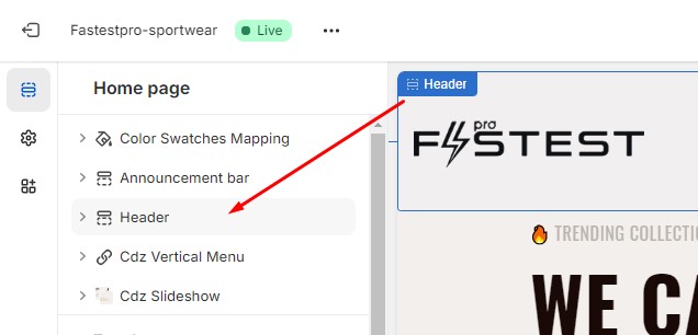
Header
Print

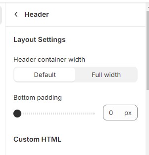
In the theme settings page, click on “Header” section, the options panel of header will be displayed. In this panel, you will see the following fields:
| Field | Description | |
|---|---|---|
| 1 | Header container width |
- Default: there are margins in the right and left side of the header. - Full Width: the header width fits the width of the page. |
| 2 | Bottom padding | The space between header and main content. |
| 3 |
Custom HTML 1 Custom HTML 2 Custom HTML 3 Custom HTML 4 |
The custom information that you want to display on the header. However, their appearances also depend on the header style. |
| 4 | Logo image | Your website logo, displayed on header |
| 5 | Logo for transparent header | The logo used for some special header style (rarely) |
| 6 | Custom logo width | The width of your logo |
| 7 | Mobile logo image | The website logo is used for mobile header. If this field is empty, the general logo will be used instead. |
| 8 | Mobile logo width | The width of mobile logo |
| 9 | Desktop menu type |
The type of menu on the desktop or tablet device: - Link list: menu with simple link lists. - Mega menu: menu with large dropdowns containing multimedia content (link lists, images, product lists, custom HTML…) |
| 10 | Menu hover style |
The effect appearing when menu top link is hovered - Underline effect:  - Background effect:  - Stroke effect:  |
| 11 | Elements (group) | There are options to show or hide elements on the header (search box, minicart, account link,…) |
