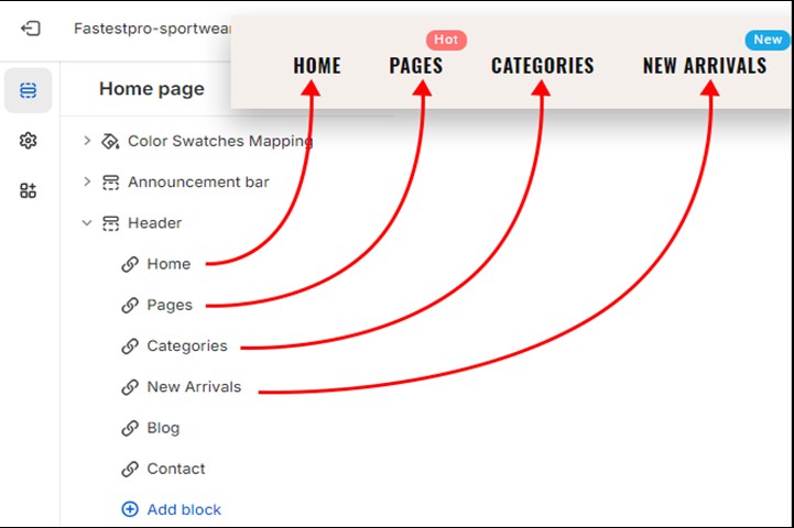
In the sections panel, go to the Header section. Eeach block under this section is a link of main menu.

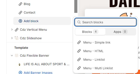
There are 4 types of block in this section:

| Block | Description | |
|---|---|---|
| 1 | Menu – Simple link | Link without dropdown |
| 2 | Menu – HTML | Link with dropdown. Dropdown is a grid of multiple custom HTML cells. |
| 3 | Menu – Linklist | Link with dropdown. Dropdown is tree structure of linklist. |
| 4 | Menu – Multi Linklist | Link with dropdown. Dropdown is a grid of multiple linklists. |
1 Menu – Simple link
There are 4 options for this kind of block:
| Field | Description | |
|---|---|---|
| 1 | Title | The title of menu link |
| 2 | Icon |
The icon class of link (e.g. las la-heart) You can use the following icon font: |
| 3 | Link | The href of menu link |
| 4 | Link Tag (optional) |
A particular tag displayed on the menu link (e.g. Hot)  |
2 Menu - HTML
| Field | Description | |
|---|---|---|
| 1 | Title | The title of menu link |
| 2 | Icon |
The icon class of link (e.g. las la-heart) You can use the following icon font: |
| 3 | Link | The href of menu link |
| 4 | Link Tag (optional) |
A particular tag displayed on the menu link (e.g. Hot)  |
| 5 | Drop down width/Enable full width |
- Use can use a value from 1 to 12 to define the width of dropdown - Or, you can enable full-width dropdown (the width of dropdown will be equal to the window width). |
| 6 | Layout |
The grid layout of dropdown: - Use slash (/) to add the new row - Use whitespace ( ) to separate columns in a row - For example: 1/1: 2 rows, each row 1 column (width = 100%) 1 1 2: 1 row, 3 columns (width = 25% - 25% - 50%) 1 1 1 1: 1 row, 4 columns (width = 20% - 20% - 20% - 20%) 1 1 1/1 2: 2 rows - Row 1 has 3 columns (width = 33.33% - 33.33% - 33.33%) - Row 2 has 2 columns (width = 33.33% - 66.66%) |
| 7 |
Content - Column 1, - Column 2 … - Column 9 |
You have 9 columns maximum. They are distributed to multiple rows based on the layout you enter. The system will get contents with top-down order and distribute them for each column on the dropdown. |
3 Menu – Linklist
| Field | Description | |
|---|---|---|
| 1 | Title | The title of menu link |
| 2 | Icon |
The icon class of link (e.g. las la-heart) You can use the following icon font: |
| 3 | Link | The href of menu link |
| 4 | Link Tag (optional) |
A particular tag displayed on the menu link (e.g. Hot)  |
| 5 | Menu | The linklist will be shown in the dropdown. You can go to menu Sales channels > Online Store > Navigation to create linklists. |
4 Menu - Multi Linklist
| Field | Description | |
|---|---|---|
| 1 | Title | The title of menu link |
| 2 | Icon |
The icon class of link (e.g. las la-heart) You can use the following icon font: |
| 3 | Link | The href of menu link |
| 4 | Link Tag (optional) |
A particular tag displayed on the menu link (e.g. Hot)  |
| 5 | Drop down width/Enable full width |
- Use can use a value from 1 to 12 to define the width of dropdown - Or, you can enable full-width dropdown (the width of dropdown will be equal to the window width). |
| 6 | Layout |
The grid layout of dropdown: - Use slash (/) to add the new row - Use whitespace ( ) to separate columns in a row - For example: 1/1: 2 rows, each row 1 column (width = 100%) 1 1 2: 1 row, 3 columns (width = 25% - 25% - 50%) 1 1 1 1: 1 row, 4 columns (width = 20% - 20% - 20% - 20%) 1 1 1/1 2: 2 rows - Row 1 has 3 columns (width = 33.33% - 33.33% - 33.33%) - Row 2 has 2 columns (width = 33.33% - 66.66%) |
| 7 |
Content - Menu 1, - Menu 2 … - Menu 9 |
You have 9 columns maximum. They are distributed to multiple rows based on the layout you enter. The system will get linklists with top-down order and distribute them for each column on the dropdown. |
